


Prueba estos 5 efectos para :hover hechos unicamente con CSS3, estan listos para aplicar, solo pega el código CSS en tu hoja de estilos y aplica las clases:
Efecto «Bump up»
Excelente para usar una lista de imágenes horizontal, lo que hace es elevar el elemento modificando el margin-top.


.ex1 img{
    border: 5px solid #ccc;
    float: left;
    margin: 15px;
    -webkit-transition: margin 0.5s ease-out;
    -moz-transition: margin 0.5s ease-out;
    -o-transition: margin 0.5s ease-out;
}

.ex1 img:hover {
    margin-top: 2px;
}
Efecto «Stack & Grow»
Al pasar el cursor por encima de la imagen, esta aumenta su anchura y altura mediante una transición CSS.

/*Example 2*/
#container {
	width: 300px;
	margin: 0 auto;
}

#ex2 img{
    height: 100px;
    width: 300px;
    margin: 15px 0;
     -webkit-transition: all 1s ease;
    -moz-transition: all 1s ease;
    -o-transition: all 1s ease;
}

#ex2 img:hover {
	height: 133px;
	width: 400px;
	margin-left: -50px;
}
Efecto «Fade Text in»
Este efecto es bastante interesante, es un div que contiene una imagen y un texto, primero se alinea la imagen a la izquierda y al div contenedor se le definen las propiedades line-height: 0px y color: transparent, para que cuando el cursor pase por la imagen, esto cambie de manera animada, dando el efecto que el texto cae.

#ex3 {
	width: 730px;
	height: 133px;
	line-height: 0px;
	color: transparent;
	font-size: 50px;
	font-family: "HelveticaNeue-Light", "Helvetica Neue Light", "Helvetica Neue", Helvetica, Arial, sans-serif;
	   font-weight: 300;
	text-transform: uppercase;
	-webkit-transition: all 0.5s ease;
	-moz-transition: all 0.5s ease;
	-o-transition: all 0.5s ease;
}

#ex3:hover {
	line-height: 133px;
	color: #575858;
}

#ex3 img{
	float: left;
	margin: 0 15px;
}
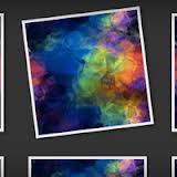
Efecto «Crooked Photo»
Ideal para una galería de fotos, este efecto usa la propiedad CSS3 -transform: rotate, hace que cuando el cursor pase por la imagen esta gire 7 grados a la izquierda.

#ex4 {
	width: 800px;
	margin: 0 auto;
}

#ex4 img {
	margin: 20px;
	border: 5px solid #eee;
	-webkit-box-shadow: 4px 4px 4px rgba(0,0,0,0.2);
	-moz-box-shadow: 4px 4px 4px rgba(0,0,0,0.2);
	box-shadow: 4px 4px 4px rgba(0,0,0,0.2);
	-webkit-transition: all 0.5s ease-out;
	-moz-transition: all 0.5s ease;
	-o-transition: all 0.5s ease;
}

#ex4 img:hover {
	-webkit-transform: rotate(-7deg);
	-moz-transform: rotate(-7deg);
	-o-transform: rotate(-7deg);
}
Efecto «Fade In and Reflect»
Este efecto solo es compatible con navegadores -webkit, ya que usa la propiedad -webkit-box-reflect, que solo es soportada por Chrome y Safari, de igual manera se ve bastante bien.

#ex5 {
	width: 700px;
	margin: 0 auto;
	min-height: 300px;
}

#ex5 img {
	margin: 25px;
	opacity: 0.8;
	border: 10px solid #eee;

	/*Transition*/
	-webkit-transition: all 0.5s ease;
	-moz-transition: all 0.5s ease;
	-o-transition: all 0.5s ease;

	/*Reflection*/
	-webkit-box-reflect: below 0px -webkit-gradient(linear, left top, left bottom, from(transparent), color-stop(.7, transparent), to(rgba(0,0,0,0.1)));
}


#ex5 img:hover {
   opacity: 1;

   /*Reflection*/
  -webkit-box-reflect: below 0px -webkit-gradient(linear, left top, left bottom, from(transparent), color-stop(.7, transparent), to(rgba(0,0,0,0.4)));

   /*Glow*/
  -webkit-box-shadow: 0px 0px 20px rgba(255,255,255,0.8);
  -moz-box-shadow: 0px 0px 20px rgba(255,255,255,0.8);
  box-shadow: 0px 0px 20px rgba(255,255,255,0.8);
}
Articulo original en DesignShack.